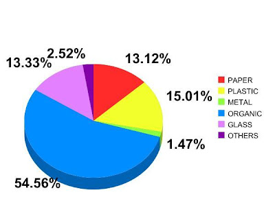
Here you have a graphic showing the class average data. I did the graphic using the following table:

We have 9 columns, one for each student who gave me the data. The right column called media (average) is the sum of all the numbers in that line and then divided into 9. The units are grams.
After that I have calculated the percentages of each kind of waste (plastic, glass, paper, and so on) and put them in a graph
After that I have calculated the percentages of each kind of waste (plastic, glass, paper, and so on) and put them in a graph
As people can see in the graph, over 50% of the waste produced by the students' families was organic.The organic waste is the most abundant kind of waste followed by the plastic waste.


